
As we eagerly anticipate the arrival of summer (come on, weather, we're waiting for you!), in the realm of interior design we are happy to see the pastel trend has sustained popularity. Colour pallets play such a pivotal role in setting the tone, mood, and atmosphere of your space so it's important you get it right.
There are so many options when it comes to choosing a colour pallet for your home, in the past we have discussed greens and autumnal tones. But Pastel colours, with their soft, muted hues stand out for their subtle elegance, soothing vibe, and timeless appeal. From soft pinks to still blues, pastel colours have impressive versatility, they can be incorporated into various interior styles, from minimalist and Scandinavian to bohemian and coastal.

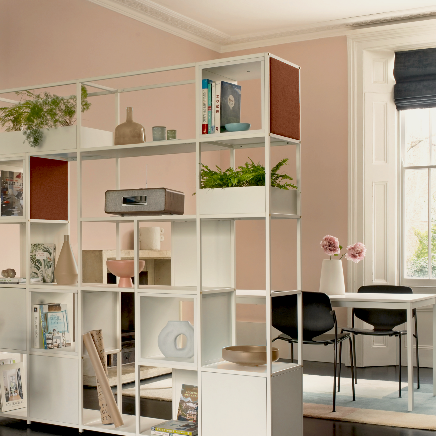
Pastel Palettes
Pastel colours, characterised by their light, muted tones, are achieved by adding varying amounts of white to pure hues. This dilution of brighter colours results in shades that are soft and delicate. The pastel pallet has lots of different hues, including blush pink, powder blue, mint green, lavender, buttery yellows, and so many more.
The subtleness of these shades evokes a sense of calm and freshness, making them ideal choices for creating inviting and serene interiors. Whether you choose to use it as the main colour scheme or introduce it as accents, pastels contribute to a soothing atmosphere that encourages comfort and well-being.
The light and airy nature of pastel shades can make a room feel more spacious and open. If you are faced with a small room, or one with restricted natural a pastel pallet is perfectly suited, their soft tones reflect light very well. Now you're probably thinking… How can I introduce this into my home?

Make a Statement
Pastel colours can be seamlessly incorporated into any interior design scheme, whether you prefer a minimalist, Scandinavian, or eclectic style. You can introduce these tones slowly or dive right in. If you decide to go bold, incorporate a pastel shade as your main colour. A great way to do so is by painting your walls. It's customary to opt for a lighter tone, consider hues like pale pink, baby blue, or light mint. Not quite ready to flood all of your walls, why not try an accent wall? Paint one wall in a soft pastel hue to create a focal point in the room. Pastel accent walls provide a gentle backdrop for artwork, furniture, and decorative accessories, allowing them to stand out without overwhelming the space.
Accent Colours
Introduce pastel-coloured elements such as scatter cushions, throws, table lamps, curtains, and accessories to add subtle pops of colour to neutral interiors. Opt for fabrics like linen and cotton for a relaxed, airy feel. This is your opportunity to showcase your personality but remember to maintain balance and cohesion. As we have discussed in previous colour-related blogs, it is usually best practice to work with around three different colours throughout the room. This approach ensures a harmonious and visually appealing aesthetic.

If you are feeling slightly more adventurous incorporate pastel-coloured furniture pieces, such as sofas, armchairs, and coffee tables. This will infuse your living spaces with understated elegance. In kitchens and bathrooms, pastel-coloured cabinetry, tiles, and accessories can impart a sense of freshness and cleanliness. Alternatively, adorn your shelves and tabletops with pastel vases, ceramics, and decorative objects for a touch of whimsy and charm.
Pastel Pairings
While pastel colours are undoubtedly captivating on their own, they also pair beautifully with neutrals and bold accents, creating visually dynamic interiors.
Pair soft pastel hues with crisp whites, warm beiges, or cool greys for a sophisticated and timeless look. Neutrals provide a subtle backdrop that allows pastel colours to shine while maintaining a sense of balance and harmony.
As we embrace the warmer months ahead, why not Inject personality and energy into your interiors by pairing pastel colours with bold, contrasting accents? Think vibrant yellows, rich emeralds, or deep navy blues to create striking visual contrasts and add depth to your design scheme.